The History of the Apple Logo: From the Rainbow Apple to Minimalism
Trace the fascinating history of the Apple logo, from the Newton illustration to the rainbow apple, to the iconic minimalist design we know today.
Introduction: a logo that became a global icon
The Apple logo is arguably the most recognizable logo in the world. This simple bitten apple has become synonymous with innovation, design, and technology. But behind this apparent simplicity lies a rich history of bold transformations and brilliant strategic choices.
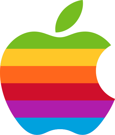
The Apple rainbow logo, used from 1977 to 1998. Source: Apple Inc.
Let's trace the evolution of this iconic logo, which perfectly illustrates how a visual identity can evolve while staying true to its essence.
1976: Apple's very first logo
Apple's first logo looked nothing like what we know today. Designed by Ronald Wayne, co-founder of Apple alongside Steve Jobs and Steve Wozniak, it depicted Isaac Newton sitting under an apple tree, with an apple hanging above his head.
This logo, rendered in a Victorian engraving style, featured a banner reading "Apple Computer Co." and a quote from William Wordsworth. The whole thing was detailed, complex, and... completely unsuitable for modern commercial use.
Lifespan: about one year. Steve Jobs quickly decided the logo was too complex and too "old-fashioned" for a company that wanted to embody the future.
1977-1998: Rob Janoff's rainbow apple
In 1977, Steve Jobs commissioned graphic designer Rob Janoff from the Regis McKenna agency to create a new logo. The brief was simple: something simple, modern, and recognizable.
Janoff then designed the famous bitten apple with rainbow stripes. Why the colored bands? For several reasons:
- The Apple II was one of the first consumer computers capable of displaying colors
- The colors conveyed a message of accessibility and creativity
- Green was placed at the top, referencing the natural leaf of the apple
And the bite? Janoff explained that it primarily served to distinguish the apple from a cherry or a tomato, and to give the fruit a sense of scale. The pun with "byte" (a unit of computing) is a happy coincidence that added to the legend.
This rainbow logo accompanied Apple for 22 years, spanning the Macintosh era, the difficult mid-1990s, and Steve Jobs's departure and return.
1998-2001: Jobs returns and the shift to monochrome
When Steve Jobs took the reins of Apple again in 1997, the company was on the brink of bankruptcy. He undertook a radical rebrand. In 1998, with the launch of the iMac G3, the rainbow logo gave way to a monochrome version.
This change was significant. It reflected:
- A desire to modernize Apple's image
- A shift toward a more refined and professional aesthetic
- Alignment with the iMac's translucent design (the logo adopted a "candy" effect)
The message was clear: Apple was no longer a niche company for enthusiasts. It was targeting the mainstream market with a premium design.
2001-2007: the Aqua era and reflections
With the launch of Mac OS X in 2001, Apple introduced the "Aqua" interface, characterized by transparency effects, reflections, and water droplet visuals. The logo naturally followed this evolution with a glossy, glass-like finish.
This period coincided with the launch of the iPod (2001), which propelled Apple into the consumer electronics world. The logo now appeared on millions of devices worldwide.
2007-2013: chrome and the iPhone
The launch of the iPhone in 2007 marked a major turning point. The logo evolved into a chrome, metallic version, matching the premium materials used in Apple products.
On MacBooks, the logo was backlit and literally glowed. This period cemented Apple as the world's most valuable brand, and its logo as a status symbol.
2013-present: flat design and simplicity
With iOS 7 in 2013, Jony Ive imposed flat design at Apple. The logo lost its reflections, gradients, and 3D effects to become a perfectly flat silhouette — often black, white, or silver gray.
This is the logo we know today: in its absolute simplicity, it works on every surface, at every size, and remains instantly recognizable.
In 2024-2025, Apple occasionally plays with colorful variations for special events, but the basic shape has remained unchanged for over a decade.
What the Apple logo teaches us
The history of the Apple logo offers valuable lessons for any business:
- Simplicity always wins: from the complex Newton design to the flat apple, each iteration simplified the design.
- Evolve without changing everything: the apple silhouette hasn't changed since 1977. Only the visual treatment has evolved.
- Your logo should reflect the era: each version of the logo perfectly matched the technological and aesthetic moment.
- Don't be afraid of strategic changes: dropping the rainbow was a risky bet, but it paid off.
- A good logo is timeless in its form: 48 years after its creation, the bitten apple remains the same.
To explore other legendary logos, check out our article on the 50 most famous logos in the world.
FAQ
Who designed the current Apple logo?
The bitten apple shape was created by Rob Janoff in 1977. The current flat treatment is the result of evolution guided by Apple's design team under Jony Ive's leadership starting in 2013.
Why is the apple bitten?
According to Rob Janoff, the bite primarily served so the apple wouldn't be confused with another fruit. The parallel with "byte" (a computing term) is a happy coincidence.
How much did the Apple logo cost?
The first logo (Newton) was designed for free by Ronald Wayne. Rob Janoff's logo was reportedly billed at a few hundred dollars in 1977 — a trivial investment given the value this logo represents today.
Why did Apple drop the rainbow colors?
Steve Jobs's return in 1997 marked a shift toward minimalism and premium positioning. The rainbow colors, associated with the 1980s, no longer matched the high-end positioning the brand was pursuing.
Will the Apple logo change again?
The apple shape seems definitive. However, Apple continues to experiment with finishes (event-specific colors, animations) while keeping the iconic silhouette unchanged.